not-so-secret Identities
We always view identity programs as great creative opportunities because they provide us with a rare chance to create a brand’s true visual essence.
Click on a logo below for a closer look at each logo, and the story behind it.
FootJoy
The challenge here was to preserve this brand’s tremendous psychological equity in their logo, while helping usher it into the present. We were able to accomplish this by mildly modernizing the icon, then balancing it with a very elegant font treatment.
United Group Services
Part of a corporate rebranding campaign we did for a major industrial contractor. It was a major step for a client with a tradition of absolutely no marketing. The changeover helped them land lots of awareness and several new customers.
A Special Wish Foundation
Pro bono work. A wonderful cause. Granting the wishes of children with life-threatening illnesses. The casualness of the hand-illustrated magic wand and formalness of the classic font combine to suggest that dreams can in fact, become reality.
Titleist Trade Dress
This product logo was developed for Titleist as part of a total packaging makeover. The icon shown was printed on defractionalized paper, creating the illusion of a hologram at a fraction of the cost. We are proud to say that it changed the way an entire industry looked at the way they packaged their products.
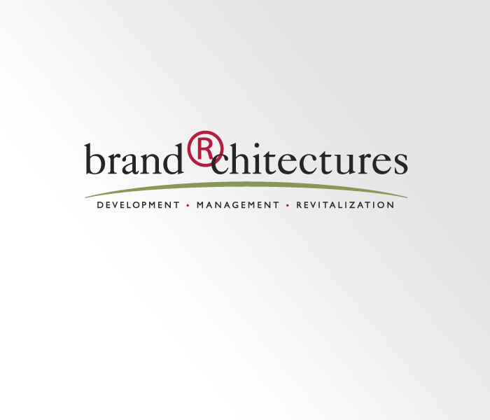
Brand Architectures
This logo was designed for a small branding consulting firm. They are very, very particular, which I think shows in the results we achieved. The use of the registered trademark was unique, but its integration with a classic font is the magic that implies the firm’s ability to strike the perfect balance between creativity and discipline.
imagine nation
Our goal was to create lasting awareness and a strong first impression. It’s based on the principle that the human mind must create order from chaos. We re-invented the word and hung the most important part upside-down to force the focus and aid retention. In seconds, we demonstrate that we know how to create ideas that break clutter.
Acushnet Healthwise
This logo was developed for an internal wellness program. Each of the four components of the program are represented as very simple icons. These icons were designed to be used “stand alone” when needed, and within one year of the launch, participation grew by over 30%. Showing the flexibility of the logo.
2005 U.S. Senior Open
Our challenge here was to avoid creating “just another tournament logo.” The logo had to be easily transferrable to every imaginable application, from apparel to stationery and everything in-between. We created a memorable identity package that conveys the prestige of the tournament.
Edwin Watts Golf
This logo and tag were created as key elements of the total rebranding we undertook on behalf of Edwin Watts Golf, possibly the most successful retailer in the golf industry. The main challenge we faced was to leverage 30 years of brand equity, while updating to a more contemporary look and feel.
2nd Swing Golf
This is an excellent example of Brand Renovation handled properly. We modernized the icon, & added the tagline to emphasize the company’s commitment to Custom Fitting. From here, we conceived and deployed a new interior environment for this retail chain. This rebranding paved the way for the group to add new products that would bring in a new audience.
Titleist
We’re not claiming this logo as our original work. But we did some major renovations around 2000 to make this most recognizable icon more consistent and easier to read at all sizes. It stands as the most identifiable logo we’ve had the privilege to work on.
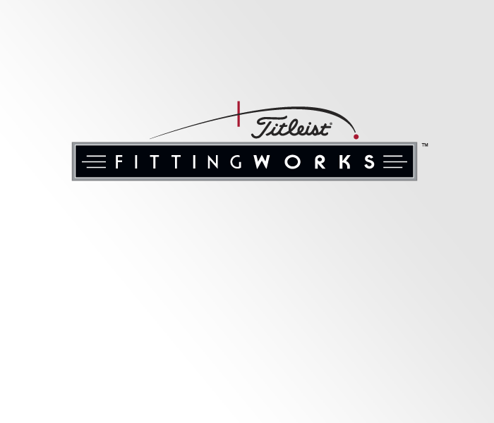
Titleist FIttingWorks
The main challenge with this logo was the complexity of all the elements and how to balance them. We had to keep the program name most prominent while not dismissing that this was a Titleist initiative. By utilizing an illustration of the golf ball going through the optimal launch window it helped make the mark unique and added a more creative element
Dayton Raiders Swim Club
As one of the most accomplished swim teams in the state of Ohio, the Dayton Raiders needed a logo that represented the competitive nature of the organization. As the elite swim team in Ohio, the Dayton Raiders wanted a log that symbolized that “star quality” the team projected. Need we say more?